This article was written by Maury Wright and originally appeared on LEDs Magazine
Orion Federal Credit Union moved its headquarters to anchor and support a historic Memphis, TN neighborhood and into a building that demonstrates options in lighting design in the SSL era.
A-Light, an Acuity Brand, has announced a solid-state lighting (SSL) project in Memphis, TN where a unique historic building afforded lighting designers the chance to focus their efforts on aesthetics given abundant natural light that floods the space. Much of the artificial lighting is focused on grazing walls and wall art and adding to the ambient layer, with task lighting only directly located over interior work spaces. Orion Federal Credit Union moved its headquarters into what once was the home of a famous bread baker and rehabilitated the natural concrete surfaces, minimally changing the internal space.
Architect LRK spearheaded the interior design with engineering assistance from HNA Engineering. Orion had chosen the office because of its location in the iconic building in a historic neighborhood undergoing a reinvention through commercial and residential growth. The credit union grasped the opportunity to be an anchor in the neighborhood.
The building had what the team considered “good bones,” a term armchair contractors that watch do-it-yourself TV shows will be very familiar with. The concept was built around respecting those bones including the concrete walls and floors, open ceilings, exposed duct work, and more.
The building featured large industrial windows that would deliver plenty of natural light. In many cases, renovations of older structures require great effort to add natural light into a space such as with this London office.
The team developed a theme around the Orion’s Belt astronomical constellation and shooting stars. The space theme is focused on low levels of artificial light only where required. The natural light afforded the luxury of plenty of light during the day.
The polished concrete walls and floors deliver what the team conceived of as a track or pathway surrounding the offices and workstations. These de facto hallways are lit with A-Light Accoled ACL3 linear luminaires mounted parallel to walls. The linear fixtures weren’t centered over the hallways but rather mounted close to the walls. And the specified HE Tech secondary optics spread the lighting onto walls and art mounted on those walls. Still, the design delivers plenty of reflected ambient lighting for workers walking about in the space.
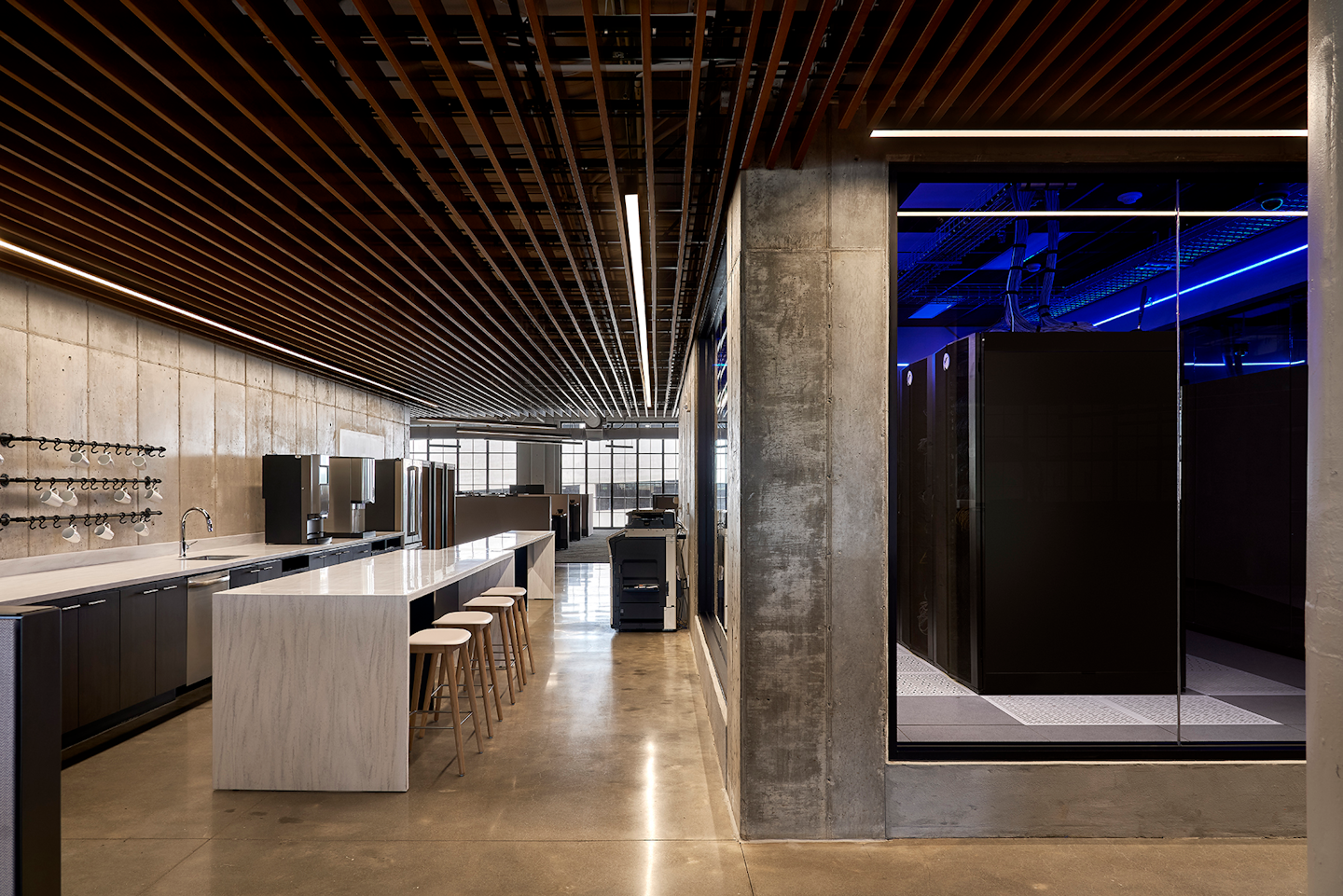
 At Orion’s new offices, designers determined a pendant fixture would not work with the drop ceiling. Instead, a recessed Accoled ACL5 LED luminaire brings consistency with the linear design aesthetic of the ACL3 luminaires used in other areas.
Meanwhile, in the workspace within the concrete hallways, the design contrasts the overall aesthetics of the space with a focus on the diagonal, a divergence from the hallway lighting (see image at top). The carpet used in the work areas features diagonal patterns. And the same ACL3 luminaires with a different direct lighting secondary optic spread the light uniformly. Each luminaire provides illumination for two workstations and provides a contrast with the rectilinear ductwork above the lighting infrastructure.
Communal areas in the office space were planned to carry through the celestial theme while acknowledging the need for different functional lighting. Even in a kitchen area and break room the designers used a linear fixture — the ACL5 — that is designed for recessed mounting and that is installed in what comes closest to a drop ceiling in the new credit union space (nearby image). The designers said that the pendant luminaires typically used in such a kitchen space would not have fit with the aesthetics in the credit union.
We also saw the ACL3 and ACL5 luminaires used in a confined outdoor space in Chicago a couple of years back. Monroe Plaza located between two office buildings uses the fixtures in a geometric design that filled the need for lighting with the skyscrapers on either side blocking natural light. The design is said to invite people into the small plaza.


